10월 23일자 구글 LatLong 블로그 소식입니다. 구글맵의 색상, 도로 두께 등 디자인이 변경되었다는 내용입니다.
예를 들어 동네 길의 두께를 줄여서 가독성을 높였고, 색상을 최적화해서 대중교통 이나 검색 결과 등의 다른 콘텐츠와 충돌을 줄였다고 합니다. 그리고... 하이브리드 모드에서 도로 선의 경계를 진하게 바꾸었다는 내용도 나옵니다.
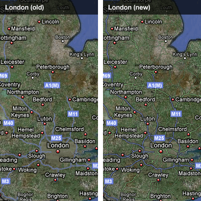
아래는 아래 원문에 있는 예중에서 한가지 가져온 것입니다. 왼쪽이 예전 오른쪽이 개선된 모습인데, 하이브리드 모드에서 길의 경계선을 강하게 표현하고, 소로도 보다 잘 보이도록 바꾸었음을 알 수 있습니다.
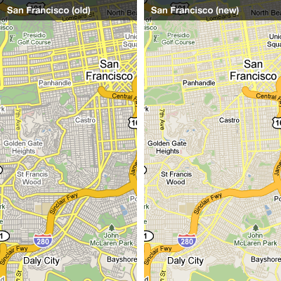
아래는 또다른 예입니다. 도로지도 모드에서는 작은 길들의 색을 약하게 만들었군요. 아마도 처음에는 한가지 표시방법 뿐이 없었는데, 경우에 따라서 표현 방법을 여러가지로 바꾼 듯 합니다.
사실 지도의 디자인은 아주 까다로운 주제입니다. 저같이 미적감각이 별로 없는 사람에겐 특히 힘든 문제고요. 아주 다양한 상황에서 복잡하지도, 허전하지도 않게, 그리고 정말 필요한 정보만을 예쁘게 보여준다는 것은 예술과 과학의 결합이라고나 할까요. 암튼 제 수준을 넘는 내용이라서 이만 줄입니다.
그나저나... 구글맵이 처음 서비스를 시작한지 겨우 4.7년 전이라고 하네요. 생각보다 얼마 되지 않았네요~~
민, 푸른하늘
====
http://google-latlong.blogspot.com/2009/10/evolving-look-of-google-maps.html
Friday, October 23, 2009 at 11:09 AM
Today
the Google Maps team is rolling out a number of refinements to the look
and feel of our maps, the biggest such changes since we first launched
about 4.7 years ago.
In that time we've been steadily adding details like walkways, address
labels, bus stops, new country coverage, and improved satellite
imagery, but the look of the map hasn't changed much.
Today's changes are intended to keep the same information-rich map while making it easier to pick out the information that is most useful. The changes affect both the 'Map' and 'Hybrid' styles, and include numerous refinements to colour, density, typography, and road styling worldwide. For example, in map view, local and arterial roads have been narrowed at medium zooms to improve legibility, and the overall colours have been optimized to be easier on the eye and conflict less with other things (such as traffic, transit lines and search results) that we overlay onto the map. Hybrid roads have gained a crisp outline to make them easier to follow, and the overall look is now closer to an augmented satellite view instead of a simple overlay.
In some areas the changes are obvious, while in others they are quite subtle. But overall we hope you'll agree they're a nice improvement. Let's take a quick world tour to see some of these changes in action...
Taking a look at a far zoom of the area around my hometown London, notice the improved readability and density of the roads in the hybrid view. The motorways are easier to follow, and the A-roads are surfaced earlier:


Jumping
west across the Atlantic to San Francisco and switching to map view
demonstrates the changes in colour and font treatment. All the same
information is maintained on the map, but there is more contrast
between background detail such as local roads, and important
orientation signals like neighbourhoods and major arterial roads:

Heading
south to Brasilia illustrates the advantages of the newly optimized
road widths. The thinner treatment at this zoom makes it much easier to
pick out fine detail in the complex local road shapes:

Heading
northwest across the Pacific, Beijing sees some dramatic changes: the
subway lines are coloured to fit local convention, the text is aligned
with the streets, and the overall colour scheme is tuned to be more
harmonious:

And
finally, completing the journey where we started, note the finer road
widths, cleaner rail lines, and less visually heavy colour scheme in
London:

We hope you enjoy the changes to your local area too!
====
예를 들어 동네 길의 두께를 줄여서 가독성을 높였고, 색상을 최적화해서 대중교통 이나 검색 결과 등의 다른 콘텐츠와 충돌을 줄였다고 합니다. 그리고... 하이브리드 모드에서 도로 선의 경계를 진하게 바꾸었다는 내용도 나옵니다.
아래는 아래 원문에 있는 예중에서 한가지 가져온 것입니다. 왼쪽이 예전 오른쪽이 개선된 모습인데, 하이브리드 모드에서 길의 경계선을 강하게 표현하고, 소로도 보다 잘 보이도록 바꾸었음을 알 수 있습니다.
아래는 또다른 예입니다. 도로지도 모드에서는 작은 길들의 색을 약하게 만들었군요. 아마도 처음에는 한가지 표시방법 뿐이 없었는데, 경우에 따라서 표현 방법을 여러가지로 바꾼 듯 합니다.
사실 지도의 디자인은 아주 까다로운 주제입니다. 저같이 미적감각이 별로 없는 사람에겐 특히 힘든 문제고요. 아주 다양한 상황에서 복잡하지도, 허전하지도 않게, 그리고 정말 필요한 정보만을 예쁘게 보여준다는 것은 예술과 과학의 결합이라고나 할까요. 암튼 제 수준을 넘는 내용이라서 이만 줄입니다.
그나저나... 구글맵이 처음 서비스를 시작한지 겨우 4.7년 전이라고 하네요. 생각보다 얼마 되지 않았네요~~
민, 푸른하늘
====
http://google-latlong.blogspot.com/2009/10/evolving-look-of-google-maps.html
Friday, October 23, 2009 at 11:09 AM
Today's changes are intended to keep the same information-rich map while making it easier to pick out the information that is most useful. The changes affect both the 'Map' and 'Hybrid' styles, and include numerous refinements to colour, density, typography, and road styling worldwide. For example, in map view, local and arterial roads have been narrowed at medium zooms to improve legibility, and the overall colours have been optimized to be easier on the eye and conflict less with other things (such as traffic, transit lines and search results) that we overlay onto the map. Hybrid roads have gained a crisp outline to make them easier to follow, and the overall look is now closer to an augmented satellite view instead of a simple overlay.
In some areas the changes are obvious, while in others they are quite subtle. But overall we hope you'll agree they're a nice improvement. Let's take a quick world tour to see some of these changes in action...
Taking a look at a far zoom of the area around my hometown London, notice the improved readability and density of the roads in the hybrid view. The motorways are easier to follow, and the A-roads are surfaced earlier:

Further
north and more zoomed in still, the small town of Portinscale in
England's beautiful Lake District shows the benefits of displaying
increased road density. Local roads, important in this context, are
now visible:


====