대략적으로 요약하자면, 구글어스(Google Earth)와 KML을 이용해 알래스카의 기후변화를 알아볼 수 있는 영상중첩(Image Overlay)를 제작하는 과정을 설명하고 있습니다. (저번글에서 말씀드린 것처럼 본문은 번역하지 않았습니다.)
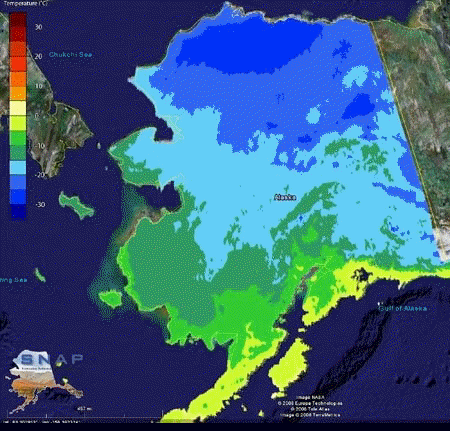
아래가 알래스카의 기온 변화를 나타낸 최종 교육자료입니다. 원자료는 Alaska Scenarios Network for Alaska Planning (SNAP) program에서 제작한 것으로, 파란색이 많은 영상은 2000년부터 2009년까지의 겨울철 기온이고, 초록색이 많은 영상은 2090년부터 2099년까지의 추정 겨울철 기온입니다. 거의 10도정도 상승하는 걸로 예측되고 있네요.
참고로, 이와같이 영상중첩을 만드는 방법은 제가 예전에 번역해 둔 글을 읽어보시기 바랍니다.
민, 푸른하늘
http://google-latlong.blogspot.com/2008/09/geo-educations-alaska-trip-diary-day-3.html
Friday, September 19, 2008 at 3:15 PM
In order to get from Barrow to Kotzebue you need to fly all the way back to Anchorage first, so Wednesday was a travel day. We spent our layover refining our lesson plans, so I thought I would share the activity I've been presenting in classrooms this week. I call it “Our Changing World: Using Google Earth and KML imagery overlays to visualize change over time."
The Earth is a dynamic planet that is not static and changes frequently through landslides, volcanic eruptions, tectonic movements, weather patterns, and the changing of seasons. Visualizing these changes can be accomplished easily with Google Earth by using the “Imagery Overlay” tool to drape additional imagery information on top of the existing globe. The "UNEP: Atlas of our changing environment" layer in the Global Awareness folder has some great examples of these kinds of overlays.
My colleague Josie and I created a simple lesson plan using two imagery overlays from the Alaska Scenarios Network for Alaska Planning (SNAP) program which includes recorded average winter temperature data from 2000 to 2009, and estimated average winter temperatures for 2090 to 2099. Students will learn how to load an example dataset -- using the Keyhole Markup Language (KML) -- within Google Earth, and the skills needed to correctly place non-georeferenced data on the ground.

Figure 1: Starting positions of two imagery overlays. The 2090 – 2099 imagery overlay is incorrectly placed in the Gulf of Alaska. Students can move the overlay into the correct location.
Students will then be able to make their own investigations to visually compare where temperatures change in Alaska based on the recorded temperature values and estimates provided by Alaska SNAP.
 Figure
2: The two image overlays, correctly placed in the Alaskan borders, may
now be used to visually compare average winter temperatures from 2000 –
2009 (left) versus estimated average winter temperatures in 2090 – 2099
(right).
Figure
2: The two image overlays, correctly placed in the Alaskan borders, may
now be used to visually compare average winter temperatures from 2000 –
2009 (left) versus estimated average winter temperatures in 2090 – 2099
(right).
 Figure 3: Students can use the Google Earth “Places” panel to activate each imagery overlay and make visual comparisons.
I also wanted to share the steps in how the Overlays KML can be used in your own class to demonstrate how imagery overlays are moved within Google Earth, and how these data may be used for visual interpretation of temperature data.
1) Download the Overlays.kml file to students’ workstations.
2) Have students load Google Earth.
3) Have students type the word ‘Alaska’ in the “Fly To” search tab; they will be flown to the state and ready to load the imagery file.
4) Have students turn on the “Borders & Labels” Layer in Google Earth (if it's not already on) by checking the box next to the name.
5) Load the ImageryOverlayLesson.kml file into Google Earth by clicking “File” and “Open.” Browse to the folder you saved it in and load the ImageryOverlayLesson.kml file.
6) A folder will be loaded into the Google Earth “Places” pane that looks like Figure 3. The Google Earth screen will now have a SNAP logo file and a temperature legend along the left screen edge, and two Alaska-shaped images will be visible on the globe. One image is in the correct location over Alaska while the second image is incorrectly located in the Gulf of Alaska.

7) Direct students to uncheck the box next to the “Average Winter Temperatures 2000 – 2009” layer (which displays the average winter temperatures recorded for January-March for 2000-2009) This will turn off the “correct” Alaskan imagery overlay and make it easier to move the second image correctly into place next.
8) Right-click
on the “Estimated Average Winter Temperatures 2090 – 2099” layer (which
estimates the average temperatures for January-March for 2000-2099) and
select the “Properties” entry. A new dialog box will appear named “Edit
Image Overlay“ and a green box of lines will surround the image.

9) Move the Alaska image by clicking and holding the left mouse button and pushing the image into place. Release the left mouse button once the image is in place.

10) Use the other green lines surrounding the image to modify image height and width as needed.
11) Click the “Ok” button to exit “Edit Image Properties” window.
12) Direct students to uncheck the “Estimated Winter Average Temperatures 2090 – 2099” layer and check the “Average Winter Temperatures 2000 – 2009” layer.
13) Correlate colors on the temperature legend with values displayed in Alaska for the “Average Winter Temperatures 2000 – 2009” layer.” Identify temperature regions for the state during winter.

14) Turn on the “Estimate Average Winter Temperatures 2090 – 2099” layer and compare the estimated values in 2090. Identify differences between this layer and the current “Average Winter Temperatures 2000 – 2099” layer.
 This
lesson is specific to Alaska, but it's easy for teachers to find data
relevant to their own geographic region, state, or city. I suggest
looking at some of the KMLs in the Google Earth Gallery to find interesting data examples such as "World Oil Consumption" or a "Rising Sea Level Animation," or other examples available on the Internet such as Google Lit Trips or the National Snow and Ice Data Center Virtual Globes Gallery.
These example KML files could be integrated into existing lesson plans
or used as the basis for new lesson plans. Some possible lesson plan
integrations include:
This
lesson is specific to Alaska, but it's easy for teachers to find data
relevant to their own geographic region, state, or city. I suggest
looking at some of the KMLs in the Google Earth Gallery to find interesting data examples such as "World Oil Consumption" or a "Rising Sea Level Animation," or other examples available on the Internet such as Google Lit Trips or the National Snow and Ice Data Center Virtual Globes Gallery.
These example KML files could be integrated into existing lesson plans
or used as the basis for new lesson plans. Some possible lesson plan
integrations include: - Identifying site locations for literature studied in class to place a story in context to the surrounding geography of an area – example includes “Candide” from Google Lit Trips (Hyperlink).
- Tracing seasonal animal migrations between regions – example birds flying South for winter and returning in the Spring.
The flexibility of KML allows creative integration possibilities for teachers in normally non-spatial topics, and can further enhance students’ learning experience of the world around them locally and globally.
Our flights from Barrow to Kotzebue, AK were very smooth and gave us plenty of time to discuss changes to our lesson plans and how we can better share information with students in Kotzebue. I look forward to visiting Kotezebue, AK and continuing our Geo Education adventure.
====구글 LatLong 블로그 목록 : http://heomin61.tistory.com/6
2008/09/17 - [LatLong] - 구글어스 알래스카 교육과정 첫날
2008/09/21 - [LatLong] - 구글어스 알래스카 교육과정 둘째 날
2008/09/23 - [LatLong] - 구글어스 알래스카 교육과정 세째 날